Note
This tutorial was generated from a Jupyter notebook that can be downloaded here.
Doppler imaging
In this notebook we will show how to use starry to model Doppler imaging datasets.
[4]:
import starry
import numpy as np
import matplotlib.pyplot as plt
Star with a grey spot
Let’s instantiate a DopplerMap. In addition to the spherical harmonic degree, we need to provide the number of epochs we’re planning on modeling (nt).
[5]:
map = starry.DopplerMap(ydeg=15, nt=20)
Specifically, we’re modeling a degree 15 spherical harmonic map with 20 epochs (i.e., the number of spectra we’ve observed and would like to model).
Let’s specify two more properties relevant to Doppler imaging: the stellar inclination and the equatorial velocity.
[6]:
map.inc = 60
map.veq = 30000
By default, these are in degrees and meters per second, respectively.
The final thing we must do is specify what the surface of the star looks like, both spatially and spectrally. The spatial map can be specified by loading a latitude-longitude map, either as an image file name or an ndarray:
[7]:
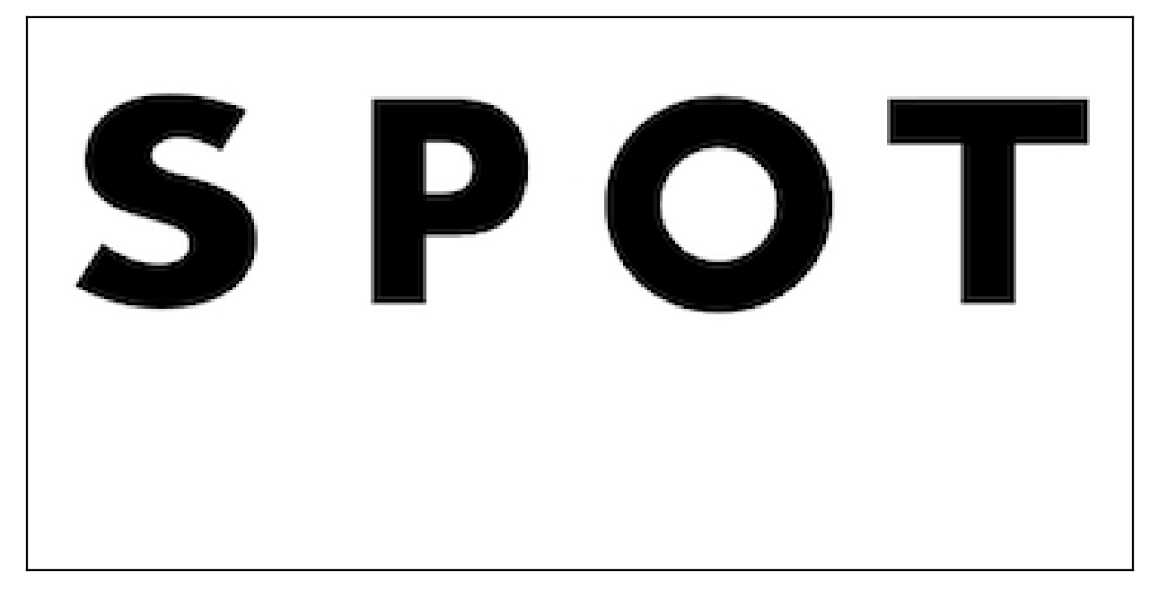
map.load(maps="spot")
The map we loaded above is the image located at starry/img/spot.png, which looks like this on a rectangular latitude-longitude grid:
Now that we told starry about what the star looks like spatially, we need to tell it about the spectrum. There are two wavelength grids associated with a DopplerMap: wav and wav0. Both of these are defined in nanometers.
The former, wav, is the wavelength grid on which the model for the observed spectral timeseries (given by the map.flux method) is defined. This can be accessed as map.wav, and can be passed in as the keyword argument wav when instantiating the map. We didn’t explicitly provide this above, so it defaults to an array of 200 points centered at 643.0 nm, the wavelength of an FeI line commonly used in Doppler imaging.
The latter, wav0, is the wavelength grid on which the local, rest frame spectrum (given by the map.spectrum property) is defined. This can be accessed as map.wav0, and can be passed in as the keyword argument wav0 when instantiating the map. Again, we didn’t explicitly provide this above, so it defaults to a similar array, but with extra padding on either side:
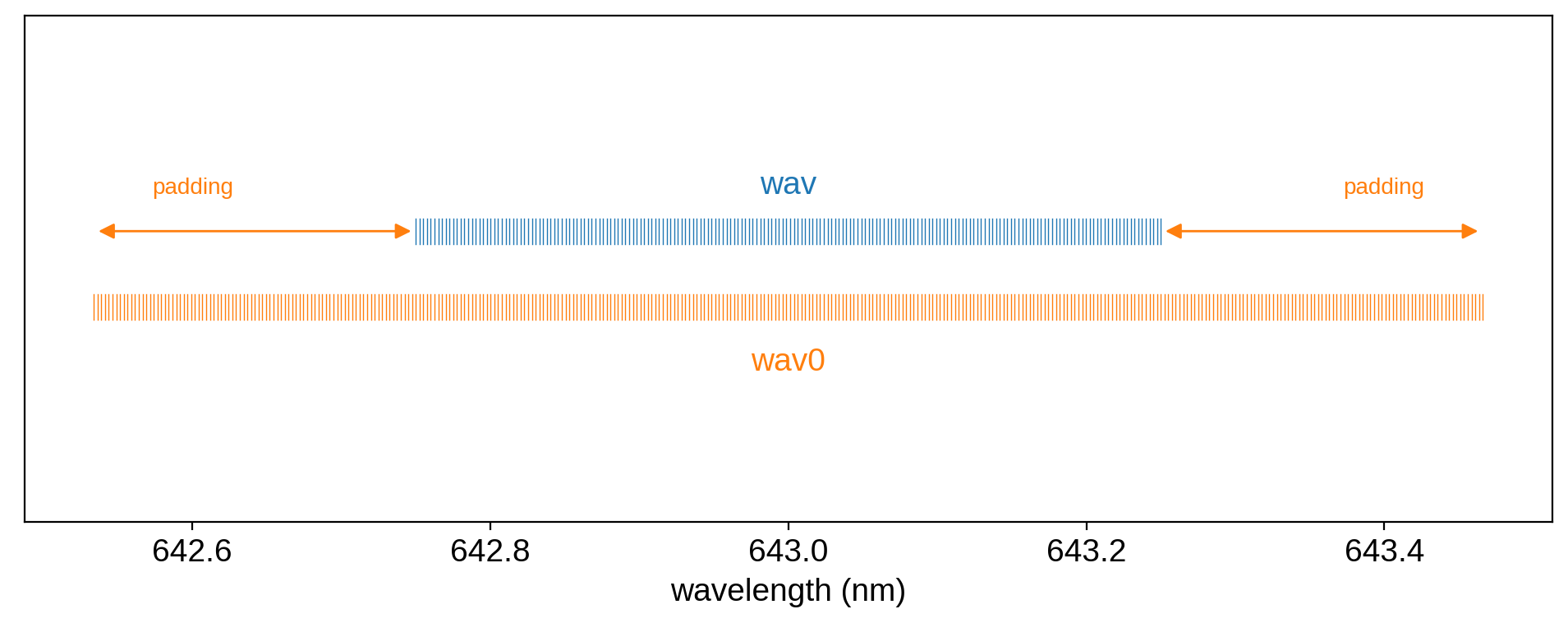
Why the padding? And why make a distinction between these two wavelength arrays in the first place? That’s because the values near the edge of the observed spectrum typically depend on a little bit of the rest frame spectrum that lies beyond the edge, thanks to the Doppler shift. The amount of padding is proportional to \(v \sin i\): if the star is rotating very quickly, we need a lot of padding to ensure there are no edge effects in computing the model for the observed spectrum.
The user is free to provide whatever arrays they want for wav and wav0, but if wav0 is insufficiently padded, starry will throw a warning:
[10]:
starry.DopplerMap(
    wav=np.linspace(500, 501, 100), wav0=np.linspace(500, 501, 100)
);
/home/runner/work/starry/starry/starry/doppler.py:268: UserWarning: Rest frame wavelength grid ``wav0`` is not sufficiently padded. Edge effects may occur. See the documentation for more details.
  warn(
Note
It’s important to note that wav and wav0 are strictly user-facing arrays.
Under the hood, starry computes the model on a different wavelength grid that’s
evenly spaced in the log of the wavelength. This grid has a number of bins equal to
the length of the wav array times map.oversample, which by default is set to
1 but can be passed in via the oversample keyword when instantiting the map.
Note also that the amount of padding is fixed when the map is instantiated, and is
computed based on map.vsini_max, which defaults to 100 km/s and can be changed
via the vsini_max keyword (note that this is in units of map.velocity_unit).
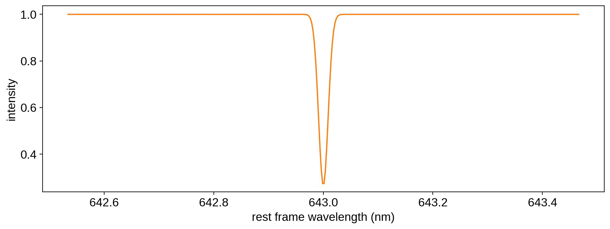
We’ll discuss these wavelength grids (and how starry interpolates between them) in more detail below. For now, let’s stick to the default grid for the rest frame spectrum, wav0, and add a single narrow Gaussian absorption line at the central wavelength.
[11]:
map.load(
    spectra=1.0 - 0.75 * np.exp(-0.5 * (map.wav0 - 643.0) ** 2 / 0.0085 ** 2)
)
Here’s what that looks like:
[12]:
plt.plot(map.wav0, map.spectrum[0], "C1")
plt.xlabel("rest frame wavelength (nm)")
plt.ylabel("intensity");
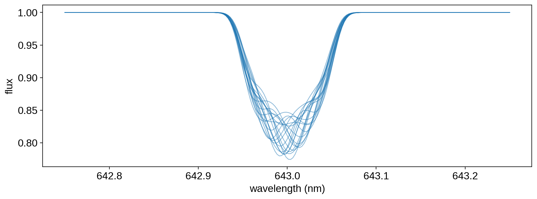
We are now ready to compute the model for the observed spectrum. This is done by calling flux():
[13]:
theta = np.linspace(0, 360, 20)
flux = map.flux(theta=theta)
In the expression above, theta is the angular phase of the star. Note that theta must be an array of length equal to map.nt, the number of epochs we told starry about earlier. The flux method returns a two-dimensional array of fluxes at each wavelength (or, alternatively, spectra at each point in time):
[14]:
flux.shape
[14]:
(20, 200)
In this case, that’s 20 spectra, one at each phase theta, each containing 300 wavelength bins. As we discussed above, the wavelength grid for the flux is given by map.wav. Let’s visualize our model:
[15]:
plt.plot(map.wav, flux.T, color="C0", lw=1, alpha=0.5)
plt.xlabel("wavelength (nm)")
plt.ylabel("flux");
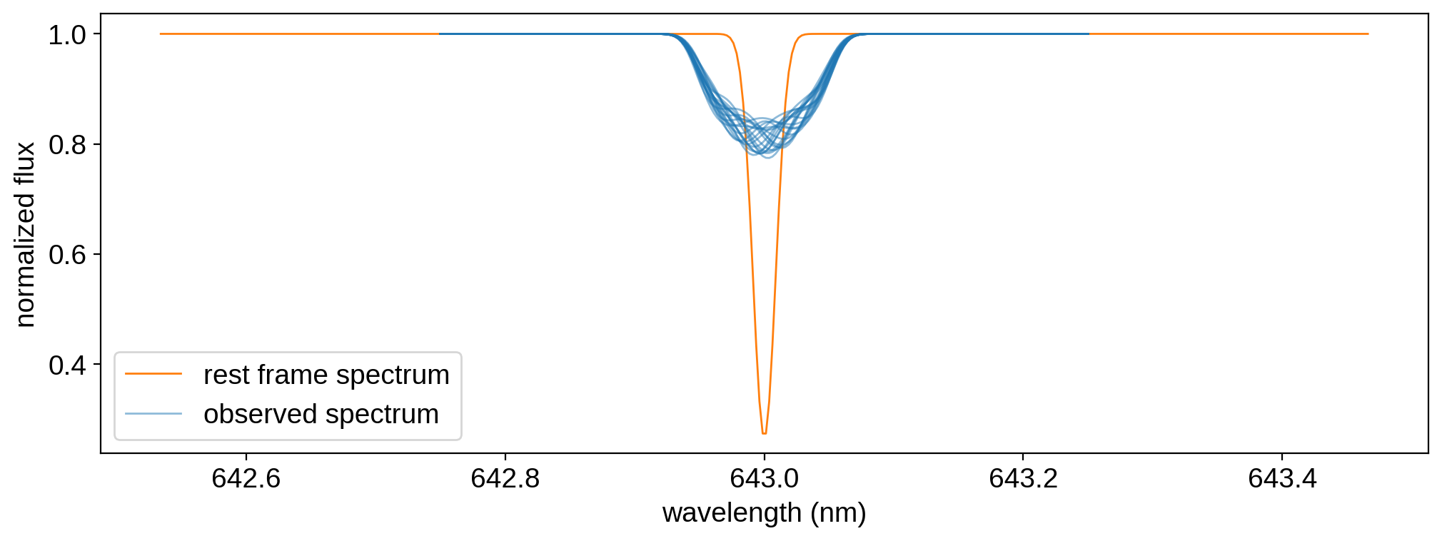
Finally, we can look at just how Doppler shifted our spectrum is relative to the rest frame spectrum:
[16]:
plt.plot(
    map.wav0, map.spectrum[0], color="C1", lw=1, label="rest frame spectrum"
)
plt.plot(
    map.wav,
    flux[0],
    color="C0",
    lw=1,
    alpha=0.5,
    label="observed spectrum",
)
plt.plot(map.wav, flux[1:].T, color="C0", lw=1, alpha=0.5)
plt.legend()
plt.xlabel("wavelength (nm)")
plt.ylabel("normalized flux");
Warning
Notebook still under construction. Stay tuned for more!